First Off Graphics layout - APT Sprint Evo 7

pablo wrote:Just spoke to Alan on the phone and he really hopes that he hasn't offended anyone by making those changes. He just felt that the graghics would flow better if reversed. Almost as if they were a physical feature of the car and you had to allow for airflow over them.
Haha, don't be silly- any comments or ideas are welcome, positive or negative!
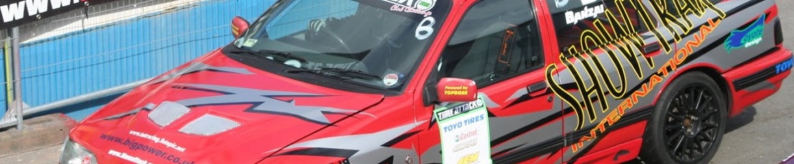
Finishing off the Ford 

blacky wrote:Any ideas, thoughts etc guys??
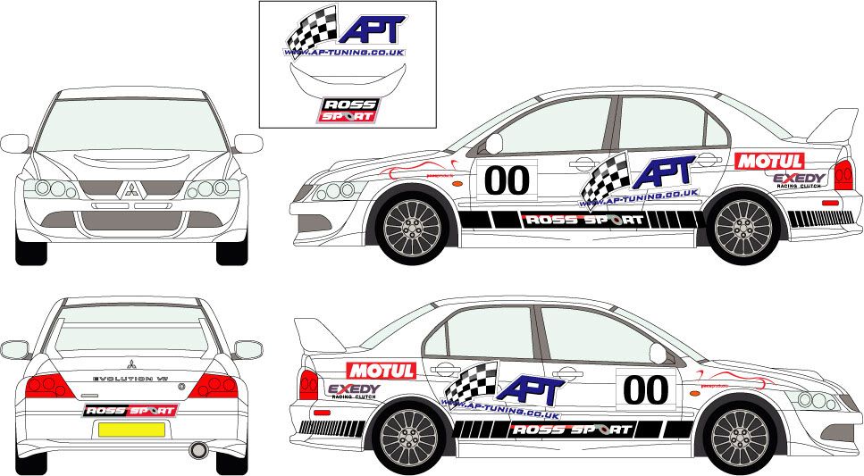
Bart wrote:hope im not treading on anyones toes with this and i dont affend anyone.
ive had a very quick play with the design.
original didnt to me flow with the direction of the car

all i have done is flipped the flag around and moved the motul and exedy graphic around.

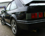
V8 supercars the greatest show on wheels

Like I said- I can't really do photoshop-type stuff... but having begun recreating the APT Evo on Forza3 ages ago and never quite finishing it, I still have the logo's (plus some downloaded from the Storefront), so I had a quick bash at my own interpretation-
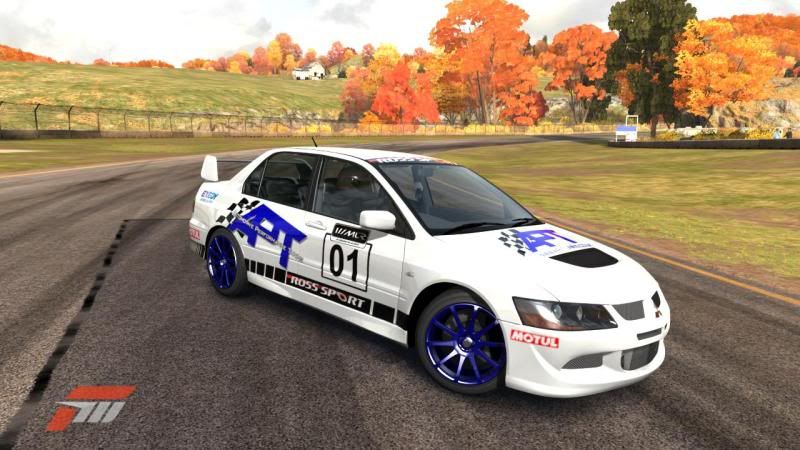
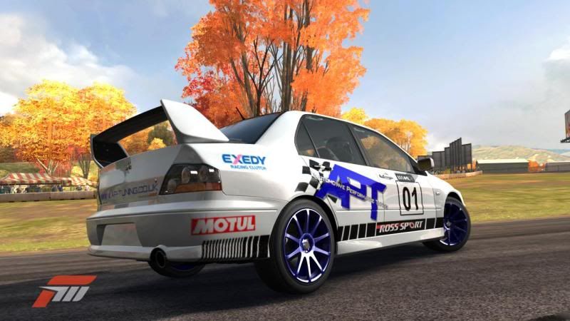
Not perfect by any means, and its missing the Pace Products and EvoDrySump.com logo's (and BigPower of course).
Not perfect by any means, and its missing the Pace Products and EvoDrySump.com logo's (and BigPower of course).
Finishing off the Ford

And so the process begins:)
1. The larger APT works but needs a little tweek to the shadow to lift it off the car.
2. The one thing Alan does is to add the stickers from the series you compete in, onto the car design as they can affect the final look of the car and wreck a good design. They have to be there so put them on.
1. The larger APT works but needs a little tweek to the shadow to lift it off the car.
2. The one thing Alan does is to add the stickers from the series you compete in, onto the car design as they can affect the final look of the car and wreck a good design. They have to be there so put them on.
Will look at this tonight as work blocks anything from photobucket:banghead::banghead:
But the quick look I had on my phone it looks pretty good with a larger APT logo, and the mlr logo on the numberboard is a cheeky little idea!
Forza graphics look pretty ace eh! Makes it look so much more real than the flat proofs!
I have to e-mail JD signs as well later, not had internet where I am staying this week either:banghead::banghead: so can add these ideas into the pot.
Cheers Dan and also Pablo and the rest of you guys for the input so far:coolgleamA:
But the quick look I had on my phone it looks pretty good with a larger APT logo, and the mlr logo on the numberboard is a cheeky little idea!
Forza graphics look pretty ace eh! Makes it look so much more real than the flat proofs!
I have to e-mail JD signs as well later, not had internet where I am staying this week either:banghead::banghead: so can add these ideas into the pot.
Cheers Dan
I think the APT needs to be much bigger, starting at the rear of the front door, running over the rear C pillar .. basically crossing the windows, almost to the point that it seperates chunks of the car ... unfortunately I don't have photoshop here to mock up what I mean .. think also the Rosssport needs to be taller, infact within the swage lines of the panel it's on ...
Dum spiro, spero
____________________________________
____________________________________

GIMP - Its photshop, just free. http://gimp-win.sourceforge.net/Stuart wrote: It's times like this that I wish I had photoshop, as I would happily knock up a few versions.
OK, its not quite photoshop, but its a good deal of the way there.

"Does the mullet make the man?"