
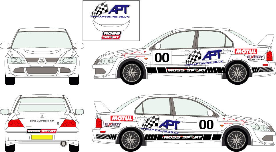
First Off Graphics layout - APT Sprint Evo 7
First Off Graphics layout - APT Sprint Evo 7
Any ideas, thoughts etc guys??


Don't like it Logan. It's times like this that I wish I had photoshop, as I would happily knock up a few versions.
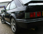
In a nut shell, it just looks like a load of stickers slapped on; not at all a cohesive design where the sponsors have been taken into consideration for style or size of logo. I have no idea about 'who is providing what' in terms of financial support but the old style of Gary and Ross' Evo with the APT on a diagonal over the rear wheels looks good and works well with the boxy Evo style.
Cohesive
Stylish
Sexual chocolate
Not knocking Adam @ JDsigns as I think he's a great lad but the design could be so much more inventive.


You're not alone Stu, it does look a little slapped together to be honest, and if I had the time (and patience) to sit down and play with some image editing software, I'd have a bash too.
Personally I think a combination of the slanted APT logo and Ross' running along the bottom edge of the doors and bumper would work well.
Personally I think a combination of the slanted APT logo and Ross' running along the bottom edge of the doors and bumper would work well.
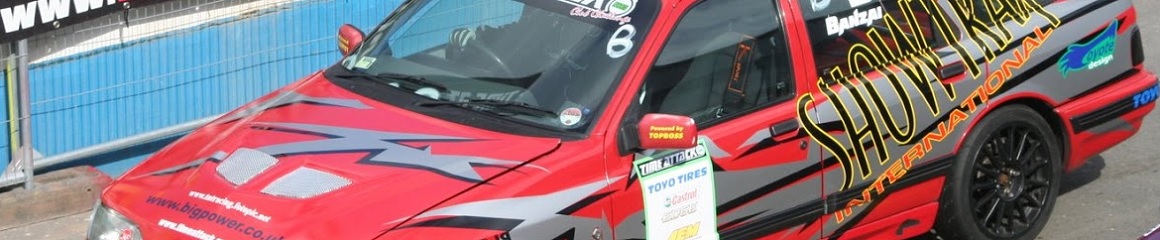
Finishing off the Ford 
